Good interfaces
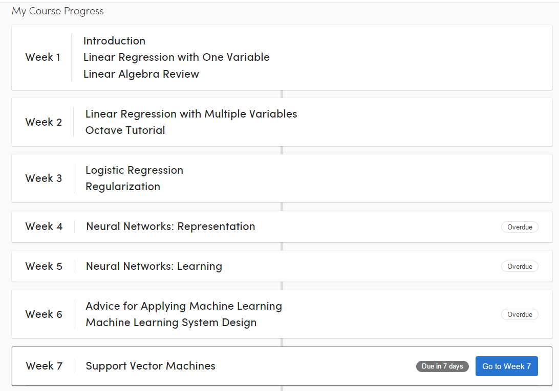
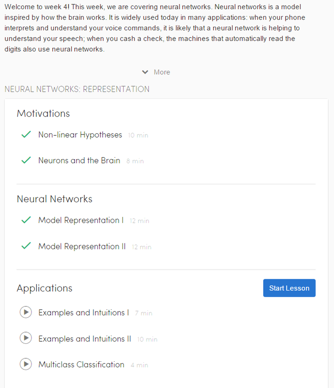
Coursera.org
Coursera is a website which offers entire courses from some of the top universities for free. The general purpose of the interface is to allow for easy navigation and progression through a course for the user. The two particular aspects of the course that I really like are the weekly breakdowns of lectures and the quick quizzes which are embedded in the videos.
In the cases of the weekly overview and the weekly breakdowns, I find that they do a great job in conveying the content that will be covered during the given time frame in a clear, clean, and concise way. Since the design is fairly minimalist, the information is clearly displayed as front and center. The mapping from all of the weeks to their respective material is done by way of a separate page per week, with a similar interface listing that week’s breakdown.
For the embedded quizzes, I find that they do both a great job in improving my attention and making me realize when I don’t comprehend a subject as well as I should. The fact that the quizzes are embedded in the middle of videos makes for a much more natural flow, and the immediate feedback and regular consistency of the quizzes have really made the difference for keeping me on track with the material on many occasions.
TED.com
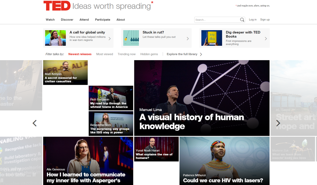
TED.com is a website which offers a host of videos on a broad range of topics, but which mainly revolve around technology, healthcare, and business. Their home page is a refreshing change from the YouTube spam of videos where. A clean, simple design offers the newest and most popular videos in an obvious but not obnoxious way.
The size of the video seems to correspond to whatever is being featured or being more popular that day. There's enough visibility but not too much over stimulation, which is great for a homepage.
Additionally the animation transitions when looking at different sections of videos are clean and (again) not overly-done.
Bad Interfaces
MS Word/Excel 2013 Start Up Screen on Windows
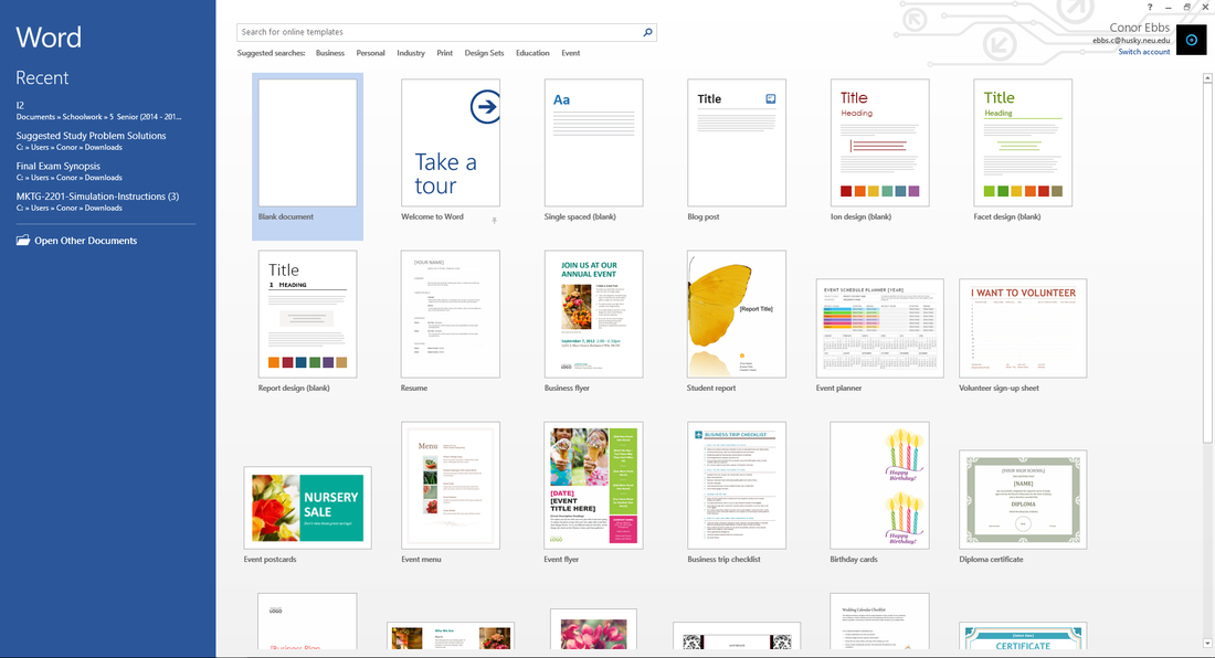
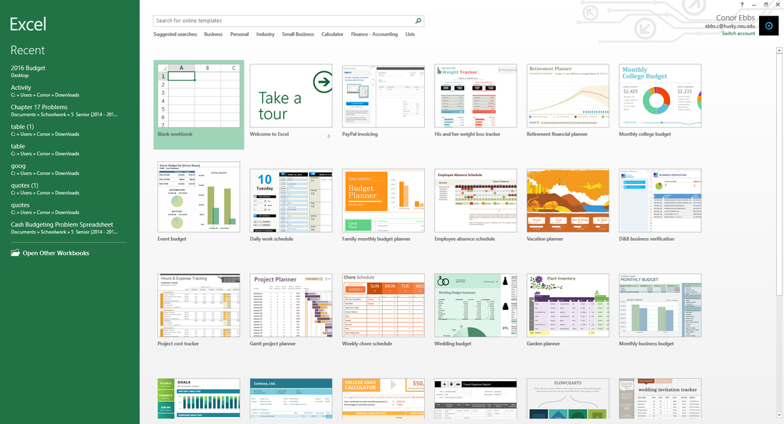
I mostly use google docs now for all of my word processing needs, but occasionally I still use MS Word 2013 and, more frequently, MS Excel 2013 on my Windows machine. One of the things that has bothered me for a few years now is the startup screens on both of these clients. Upon startup, they display an overwhelming list of almost entirely unneeded and un-used templates. I’m fairly certain I’ve never used a single template in Word or Excel and yet every time I start up either of the clients, the massive list pops up in my face.
To be specific, I find this feature to be bad (obnoxious) because, although it’s only one additional click to get to a blank template, it isn’t what I expect to happen when I start up the clients, and the vast majority of the time it makes the user take an additional, unnecessary step to get to where they want to go.
This interface could be improved without taking out the functionality by automatically opening up a blank document on startup, and then having a pop-up on the side which offers the more commonly used templates, which then disappears after 10 seconds of no interaction. This way, the majority of users get to skip an unnecessary step when creating a blank document, and the people who want to create a document based off a template could still have the same functionality, just not quite as pronounced and obvious as the current method.
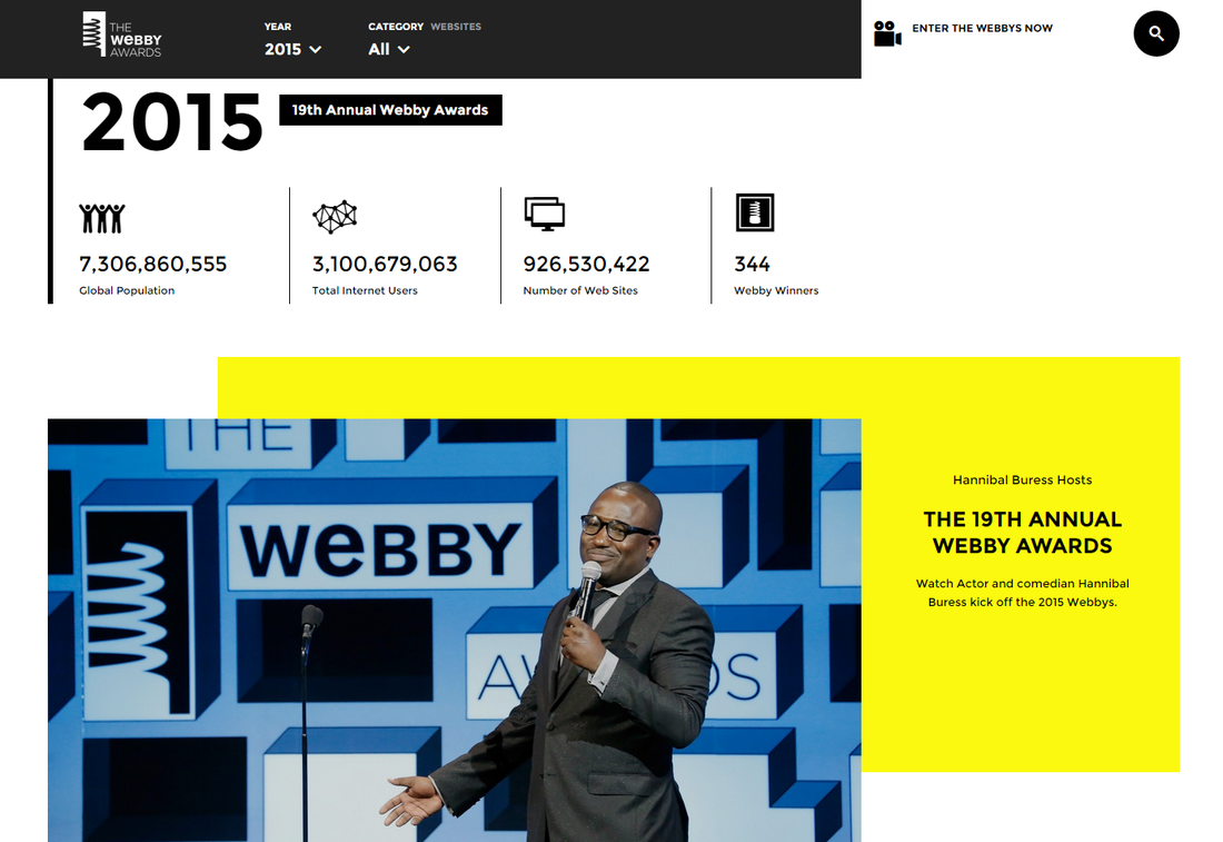
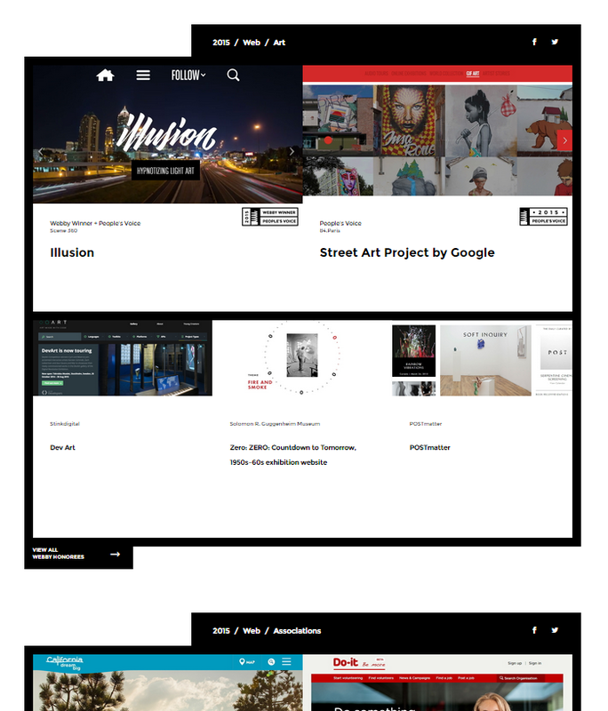
webbyawards.com
Ironically, one of the websites I visited to try to find some well designed websites ended up being the website I ended up disliking the most. WebbyAwards.com consists of a giant list of the websites they have deemed to be the best in each of their (incredibly expansive) list of categories.
Each of the winners get their own cumbersome box, which makes the space around it unusable and is obnoxious to scroll through. And they don't leave you any option but to scroll, because there doesn't seem to be any navigation on the site (at least for categories), so in order to see all of the winners, you have to scroll through all of them. There are 207 winners. Each of which have the unsightly block which takes up a disproportionate amount of room for how much information it offers. It would take easily over 5 minutes of continuous scrolling to reach the bottom of the page. That's not visible and its frustrating.
The site would be much better if there were obvious categories for the winners which you could click through at a top nav and find what you're looking for. They could also stand to just remove a hundred or so categories...